Logo and Graphic Standards
The graphic signature of the City of Vaudreuil-Dorion is its only formal identifying mark. It was designed to be distinctive, easy to recognize, and adaptable to all methods of reproduction.
New logo
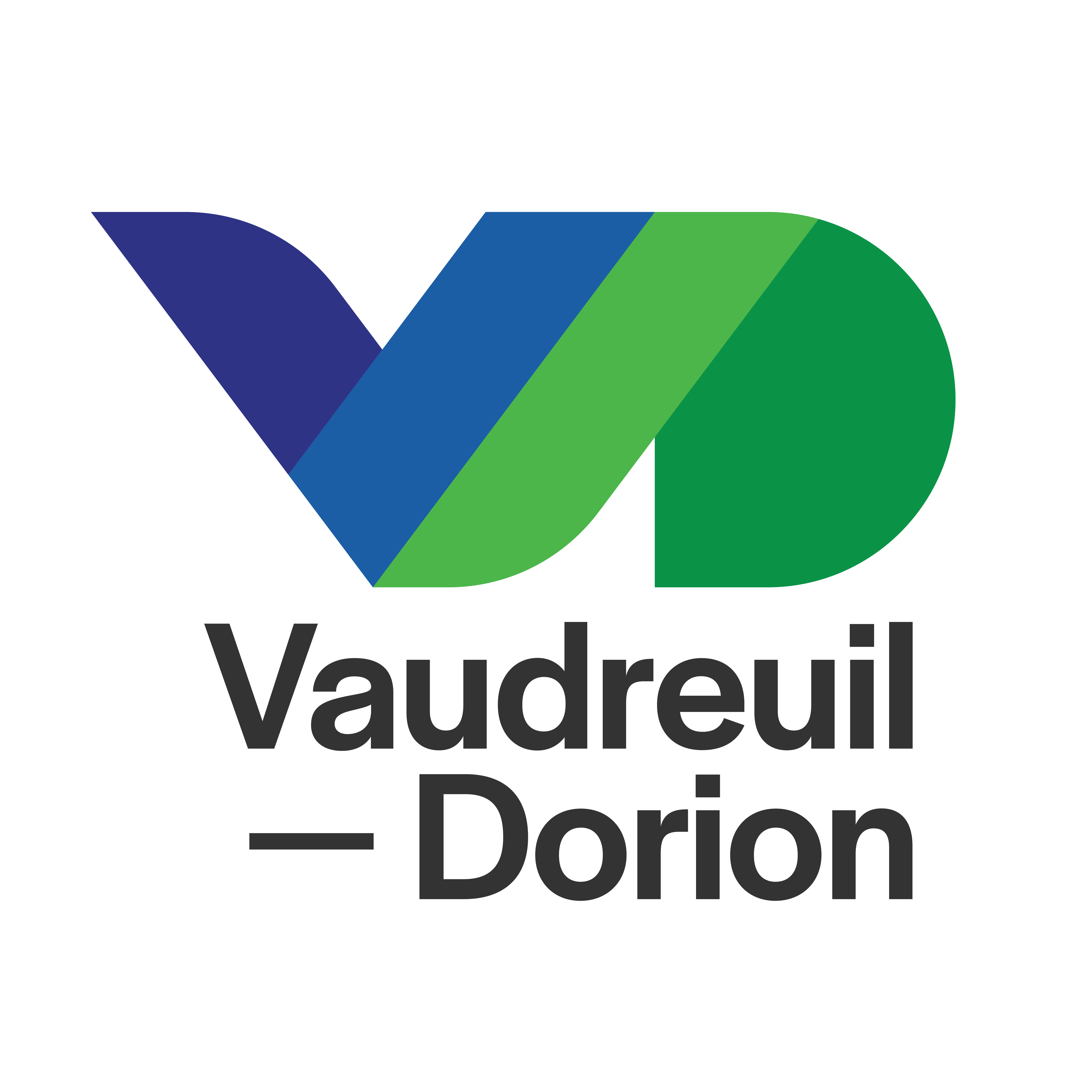
It is with a great deal of pride that the City of Vaudreuil-Dorion unveiled its new logo in November 2022, which will gradually replace the old visual identity dating back to the merger between the cities of Vaudreuil and Dorion. The updated graphic signature boasts a style that is more modern and dynamic, reflecting what the City of Vaudreuil-Dorion has become.
Logo description
The two distinct logos have been replaced by a V and a D that have now been merged. The City's new logo is designed with a look that is both sleek and dynamic, making it practical and flexible in its use. It is designed to stand the test of time. The visual identity offers a wide range of colours, variations and options. The blue and green were maintained but were given a new tone that is more striking, with an intensity that better reflects the image of the City. The V for Vision expresses Vitality and Value, while the D stands for sustainable Development, Diversity and Dynamism.

Graphic charter
The graphic charter is built around a main version of the logo and a typeface. The graphic elements that go along with it offer several variations and possible options, all while remaining consistent in its many conceivable applications.
Use of the logo
The City of Vaudreuil-Dorion holds exclusive copyright in the logos of the City and of the “Je suis...” project. These logos are also protected by the Trade-marks Act. No use is permitted without the express written consent of the City.
For questions regarding use of the City logo, please contact the Communications Department at communications@ville.vaudreuil-dorion.qc.ca.
Master Plan for Exterior Signage
The objective of the Master Plan for Exterior Signage is to standardize signage and public information and facilitate access to services for citizens and visitors. The plan serves as a guide to help identify the buildings associated to all municipal facilities throughout the territory of Vaudreuil-Dorion.
Old logo
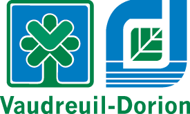
The graphic signature is made up of the logo and the name "Vaudreuil-Dorion". The logo represents the two old municipalities (Vaudreuil and Dorion), amalgamated since 1994.

Left section: Vaudreuil
- The green border represents the green spaces.
- Blue symbolizes the surrounding bodies of water.
- The tree stands for growth, greenery and quality of life.
- The shape of the leaves at the top calls to mind the V of Vaudreuil, while the way in which they are drawn, as arrows, refers to its role as central city.
- The background forms a cross symbolizing our architectural heritage.
Right section: Dorion
- The shape is a capital D for Dorion, and its interior represents the territory of Dorion.
- The blue of the D represents the surrounding water, and the lines running through it evoke reflections in the water, quiet and serene.
- The opening at the top means that Dorion is easily accessible. It also symbolizes openness to worthwhile ideas.
- The green leaf in the middle expresses the nature element, which has a strong presence over the entire territory. The leaf is divided into six parts representing the six districts that make up Dorion.
Tagline
The City adopted the tagline L’Avenir est ici! (“The future is here”) to express its vitality. These words aptly reflect how the municipality has grown and developed over the past years.
